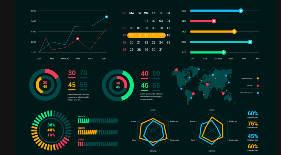
Data Visualization is an integral part of a presentation. It can decide between your presentation being cluttered and confusing or making it concise and crisp. Analytics and big data make the most valuable contributions to material design for high-tech industries. Visualizing data, such as charts, histograms, maps, tables, dashboards, graphs, and infographics, is critical to getting points across.
Given the ever-evolving cloud computing technology, demand for data and analytics is more vital than ever. One study, for example, revealed that 79 percent of executives believe avoiding big data could result in losing to competitors—and may even lead to extinction. Today, big data AI Analytics & Machine Learning Algorithms enable entirely new ecosystems, serving as foundational tools.
Adding data visualization to your presentation will make it easier for your audience to comprehend, assimilate, and retain information. Of course, making compelling presentations gets easier when you use data visualization. It can be daunting to create presentations out of data. Making a visual depiction of a mess of numbers and data is one of the finest methods to make sense of it.
The data is helpful only when your audience can interpret it. You can build the most effective and efficient manner to represent your data by first understanding and selecting the appropriate medium. Always remember that every number conceals a narrative, and a data visualization ppt will assist you in telling that narrative. There are a few tips you must consider in your plan.
Why Data Visualization Is Essential In Presentations
Data Visualization is the representation of data using common graphics, such as charts, plots, infographics, and even animations. These visual displays of information communicate complex data relationships and data-driven insights in a way that is easy to understand. Usually, data visualization can be utilized for various purposes, and it is not only reserved for use by data teams.
Management also leverages it to convey organizational structure and hierarchy, while data analysts and data scientists use it to discover and explain patterns and trends. Technically, data visualization software can help with quality presentation. However, you must be creative, as you would not want to cramp data and confuse your target audience with your data presentations.
There’s a big difference between collecting data and effectively using it to drive profits and improve operations. Data needs to be processed, prepared, and organized for any use, and a vital part of the refining process involves making data easily understandable for employees. This is why data visualization—graphically representing data sets—is becoming an increasingly integral part.
Data Visualization can vary depending on the data category you’re working with. There are seemingly infinite ways to present data when it boils down to it. Be that as it may, the Webtechex Team categorizes data visualization into the most fundamental purposes: idea generation, illustration, visual discovery, and everyday data science processes. We’ll delve deeper into them below:
A. Idea Generation Processes
Data visualization is commonly used to spur idea generation across teams. They are frequently leveraged during brainstorming or Design Thinking sessions at the start of a project by supporting the collection of different perspectives and highlighting the common concerns of the collective. While these visualizations are usually unpolished and unrefined, they help set the foundation within the project to ensure that the team is aligned on the problem they want to address for critical stakeholders.
B. Idea Illustration Processes
Data visualization for idea illustration assists in conveying an idea, such as a tactic or process. It is commonly used in learning settings, such as tutorials, certification courses, and centers of excellence. Still, it can also represent organization structures or processes, facilitating communication between the right individuals for specific tasks. Project managers frequently use Gantt charts and waterfall charts to illustrate workflows. Data modeling also uses abstraction to represent and better understand data flow within an enterprise’s information system, making it easier for developers, business analysts, data architects, and others to understand the relationships in a database or data warehouse.
C. Visual Discovery Processes
Visual discovery and everyday data viz are more closely aligned with data teams. While visual discovery helps data analysts, data scientists, and other data professionals identify patterns and trends within a dataset, everyday data viz supports the subsequent storytelling after a new insight has been found.
D. Data Science Processes
Eventually, data visualization is a critical step in the data science process, helping teams and individuals convey data more effectively to colleagues and decision-makers. Teams that manage reporting systems typically leverage defined template views to monitor performance. However, data visualization isn’t limited to performance dashboards. For example, while text mining, an analyst may use a word cloud to capture key concepts, trends, and hidden relationships within this unstructured data. Alternatively, they may use a graph structure to illustrate the relationship between entities in a knowledge graph. There are several ways to represent different data types, and it’s important to remember that it is a skill set that should extend beyond your core analytics team.
E. Data Transformation Processes
Effective data visualization starts and ends with clean, organized, and processed data. How you transform your data is critical to this, in terms of both process and how. FP&A is assembled by analyzing complex and diverse datasets that need to be cleaned, blended, and shaped into a final form. Often times this involves high degrees of collaboration between data engineering and analytics teams. It also requires rich data documentation to back up compliance processes.
The Steps To Make Compelling Presentations With Data Visualization
We’re moving beyond the spreadsheet era and into the digital age. The proliferation of modern, SaaS-based platforms has made it easier to present data in a way that is visually pleasing to end users—and much more “exciting” than looking at spreadsheets. For most people, reading a colorful and organized chart is much easier than sifting through data in a spreadsheet or report.
The brain, after all, has to store information to process it. Making data highly visual—meaning clean, organized, colorful, and easy to read—makes it much easier for most of us to make sense of it. Researchers have found that the human brain processes visuals 60,000 times faster than text. Moreover, 90 percent of all information transmitted to the brain is relayed as visual messages.
Add it all up, and data visualization is a no-brainer. Before starting your data visualization process, it will help you understand clearly what you want to show. That way, you can narrow your selection and tell a compelling story with your data. Data visualization can be straightforward if you’re working with a narrow dataset. If not, it can be challenging, and more support is needed.
It largely depends on what you’re analyzing and what you need to communicate. For this reason, businesses must be cautious about approaching large and complex datasets. It’s essential to thoroughly understand each data structure to determine the visualization that can most accurately represent it. With that in mind, below are steps to consider in your data visualization plan.
Step #1: Ensure you know your audience
Ultimately, it’s crucial to understand your audience and the one thing you want them to take away from your data. What effect do you hope your information will have on them? Are they familiar with the subject of your presentation? Are they comparable salespeople? Do they care about the connections between the data you’re presenting? Remember, you want to hold your audience’s interest as a storyteller. You are employing images rather than words to accomplish it.
Step #2: What are you trying to present?
It’s important to know what your narrative for the presentation is. What do you want others to learn from your data? Imagine that you are the sales manager of a successful car dealership and want to highlight the results of a recent marketing initiative. You would assemble the top-selling models and the campaign’s impact on sales. That’s your narrative. Understanding what you want your data to convey will help you visualize it.
Step #3: Compile and segment all data
Part of the challenge of representing big data is breaking it down to a point where it’s digestible and compelling—without making it too simple. For example, when working with millions of data points, it’s easy to conclude while overlooking intricacies and patterns. The data segmentation step helps in making a solid presentation. Prepare your information before you do anything else.
While creating your slides, there may be a lot of information to consider, particularly for lengthy corporate presentations. The entire process will be more straightforward if everything is prepared and arranged. If you wish to save time on building a presentation or don’t possess the skills to design one, you can check out pre-designed free PowerPoint templates. These editable templates are designed by industry and graphics experts to help you in your presentation journey.
Step #4: Define relationships and compositions
On the one hand, relationships describe data connections across different tables and spreadsheets. To visualize correlations, try using a scatter plot, a bubble chart, or a heatmap. Connections can be demonstrated using arc or chord diagrams, connection maps, network diagrams, and tree diagrams, to name a few. Heatmaps and Marimekko charts can also be used to describe relationships.
On the other hand, data compositions, or part-to-whole relationships, can be communicated in many different ways. To narrow down your selection, you’ll want first to determine if your data is dynamic or static. For example, dynamic data could be visualized using stacked columns or area charts. Static data is best organized using column, area, and pie charts.
Step #5: Use a data visualization software tool
Finding the suitable chart format for your data type is one of the keys to successfully visualizing your data. Your data should be concise, understandable, and easily understood. Choose a chart type that can present your data clearly and effectively to increase the likelihood that your story will be understood.
Employ a pie chart to illustrate the relationship between several components of a whole, such as the mobile device used by website users or the breakdown of overall sales per sales representative. These charts illustrate composition: Pie, Stacked, Bar, Waterfall, Mekko, and Area. With pre-design PowerPoint Themes, save time designing charts and make stunning presentations.
Step #6: Conduct some data comparisons
Comparisons indicate differences across values. You may want to explore using tables or bar charts to compare multiple items. You could also compare data over time using line or area charts. As you can see, there are countless data visualization steps to consider in your work plan. These are just a few examples to help point you in the right direction. Try experimenting with different data visualization options; over time, you’ll figure out how to present your data most effectively.
Step #7: Prepare data for sharing and collaboration
Accepting and embracing error is a fundamental part of the data analysis and visualization process. This, of course, can be frustrating—especially if you’re analyzing information alone. Through collaboration, departments can collaborate to discover unique trends and exchange visualization input—collaborating on analytics assets and sharing knowledge across the organization.
Some Software Tools Can Help Address Presentation Pain Points
When displaying quantitative data, a picture is worth a thousand words. Instead of attempting to describe the data and temporal relationships in words, a simple line graph can clearly show a pattern or trend. As such, PowerPoint is a great tool that offers many data visualization tools that can assist with the more challenging element of constructing charts, graphs, and diagrams.
However, it’s up to you to refine and maximize them; you must decide what represents your data effectively. Remember that PowerPoint is just one option out of several available. Furthermore, infographics, pictograms, and Venn diagrams can show many types of information. Still, think-cell is another essential application tool when addressing your typical PowerPoint pain points.
By all means, think-cell helps you create stunning charts in minutes, boosts your slide layout, and automates your regular reports. All this is done with a single PowerPoint add-in. Moreover, you can use maps to display information about countries and states. This makes it easier for the audience to prioritize the information. Flowcharts are used for a series of events, just like timelines.
The critical distinction is that timelines include established beginning and end points and precise dates. On the other hand, flowcharts depict the progression from one step to the next. They are ideal for communicating information and operations that require a specific order. They can also assist you in effectively and attractively presenting information about causes and effects.
PowerPoint Charting Done Right:
- Gantt. Calendar-based Gantt charts. …
- Waterfall. Automatic waterfall charts. …
- Arrows & labels. Data-driven visual annotations. …
- Mekko. Mekko charts for complex analyses. …
- Process flow. Flexible process flows. …
- Data automation. Automated data visualization. …
- Intelligent text boxes and chart scanners.
You could use a timeline if the information you want to portray is chronological. It’s the most efficient technique to use available space to demonstrate the passage of time. Timelines can be used, for instance, to display the history of your firm or essential occasions that have impacted it. They can also be integrated with other forms of data visualization, just like maps.
Mistakes To Avoid While Making Data-Heavy Presentations
As much as possible, avoid charts! They are excellent for organizing quantitative data but not so great for showing it. Charts often overwhelm a viewer, especially with numerous variables or columns. There is too much information to present all at once, and it will be more of a hindrance than a help. Use your creativity and substitute the charts for other tools, such as a line graph or a Venn diagram.
Highlight strategic information to aid your presentation and solidify your narrative. Make sure your presentation is hyper-focused on your firm and its performance. This will make your presentation unique and relevant. Lastly, remember to use templates! Templates are your best friend when you want to make an excellent and concise presentation on a deadline.
In addition, there is data visualization software that you can use to your advantage. However, you must be creative, as you would not want to cramp data and confuse the presentation. Creativity will help you place the data visualization tools in the correct slides, greatly enhancing your presentation.
Looking Forward To The Future
Worldwide Big Data market revenues for software and services are projected to increase from $42B in 2018 to $103B in 2027, attaining a Compound Annual Growth Rate (CAGR) of 10.48%, according to Wikibon. According to an Accenture study, 79% of enterprise executives agree that companies that do not embrace Big Data will lose their competitive position and could face extinction.
83% have pursued Big Data projects to seize a competitive edge. At the same time, Forrester predicts the global Big Data software market will be worth $31B this year, growing 14% from the previous year. The global software market is forecast to be worth $628B in revenue, with $302B from applications.
According to an Accenture study, 79% of enterprise executives agree that companies that do not embrace Big Data will lose their competitive position and could face extinction. 83% have pursued Big Data projects to seize a competitive edge.
Fast forwarding into the future, it’s worth mentioning that Sales and Marketing, Research & Development (R&D), Supply Chain Management (SCM), distribution, Workplace Management, and Operations are where advanced analytics, including Big Data, are making the most significant contributions to revenue growth today.
In Conclusion;
Business data is becoming increasingly complex with each passing year. These days, companies are pulling data from sources like IoT devices, sensors, and apps—none of which may communicate with one another. As mentioned, data visualization can be straightforward if you’re working with a narrow dataset. If not, it can be challenging, needing external support or data software tools.
It largely depends on what you’re analyzing and what you need to communicate. For instance, the most substantial quality of flowcharts is that, in contrast to timelines, they can also be circular, indicating that this process is repeated. As new data processing tools are coming to market, many businesses are looking for ways to put crucial data analysis into the hands of ordinary workers.
Or rather, employees who lack deep technical knowledge. While this is more easily achieved with the right tools, businesses should be careful about taking this approach. Data communication should be left to trained experts without proper tools to avoid drawing incorrect conclusions.


