If you want to know why color contrast is so important in web design, you should look no further than how even big companies like Google utilizes them. Especially, while merchandising some of their topmost web platforms and applications.
At its core, checking for good resultant color contrast in your graphics design is very important for optimal readability. Moreover, when you create color palettes for your web design projects, chances are that you’re testing the color combinations for great contrast.
If you’re not testing the color combinations of your designs, you might not be considering the eventual readability of the design. And thus, you’ll be losing the very potential audience you target. Some web users — if not all — are quite sensitive when it comes to the choice of your design colors.
What is Color Contrast in Web Design?
In web design, Color Contrast is the difference in light between the font (or anything in the foreground) and its background. So, in terms of web accessibility, how well one color stands out from another color determines whether or not most people will be able to read the information.
On the other hand, the Color Contrast Ratio is the numerical value assigned to the difference in light between the foreground and the background. And in terms of web accessibility, the color contrast ratio is how contrast is actually measured.
All this is possible because colors on the web, colors are generated through unique codes. While providing a way to accurately analyze and compare those codes against each other, resulting in a ratio. Usually, graphics are used for explaining things and ideas that are not expressed by words.
Related Topic: Website Builders | What are their Striking Pros and Cons?
For instance, shopping and e-commerce website uses a great deal of graphics so as to illustrate their products’ pictures. At the same time, websites that don’t have web graphics don’t appeal to visitors.
For this reason, I’ve been working on a very unique color combinations process. In order to help me ensure good color contrast and readability in all my web projects. But, it’s all thanks to some helpful color contrast accessibility tools.
As an example, the appropriate use of Canva, Adobe Photoshop, Flash Design Studio, Adobe Dreamweaver, Fireworks Studio, etc. greatly assists in designing and creating unique website graphics. So now, I think I have something that is working.
Related Topic: Infographics | 5 Simple Steps to Make a 1 hr Killer Designs
And that’s why I wanted to share with others in the event that you find it helpful, too. However, I should mention that I’m far from an accessibility expert. But, my goal here — as a webmaster — is to simply show that a little bit of effort can go a long way.
Particularly when it comes to selecting colors with optimal readability in mind. Therefore, with the little experience and knowledge that I’ve gathered so far, I’ll guide you more. But even before that, let’s first clear things out why web graphics color contrast is important.
Why is Color Contrast in Web Design important?
Basically, the way graphics on any website are represented is as significant as the content itself. Excellently designed website graphics can give better and creative ideas to the customer of what they are looking for. Then again, they help designers to enhance the website design even further.
By adding unique colors to any graphic design, it visually appeals to all its target audience — from newbies to pros alike. It also helps in providing an artistic professional touch to your creativity. But, the successes of web graphics depend upon effective and efficient placement on the websites too.
The appropriate placement of graphics content not only attracts end-users but also makes the website well turned-out. Moreover, these professionally created graphics reflect the creativity of a webmaster too. As well as enhancing their website design quality. What’s more?
1. It’s more than just a good art
Website graphics not only communicates with the power of a text but also the visual sync of art. Whereby, by taking the strengths of imagery (visual communication) and words (verbal communication), we can connect effectively.
The pictorial language of anything gives details of particular products and is easily understood by people. Also, the related graphics of products simplifies the content and helps in easy interpretation.
2. Helps in visual graphics storytelling
You can explain something more easily with a well-designed graphic than a picture or text. It can be difficult for a reader to picture a concept they don’t comprehend. But, they can better grasp it if they see a diagram or a graph.
This explains why so many school textbooks are filled with them. For example, the water cycle is a bit of a throwback, but you can also discover graphics for some more grown-up topics you might still be struggling with. You may even stumble upon infographics where you least expect it, such as in webcomics.
As an example, XKCD is a long-running comic that mixes math and computer programming with humor and social commentary. It’s known to use them to communicate quick gags or extensive, amusing explorations of complex topics.
3. It helps in summarizing huge content
In general, the information you want to share determines what way will be best to visualize it. Then again, the best-suited graphic can be a part of your wider marketing strategy. In terms of helping to get your information and name out there.
But, only by focusing on the quality of your graphic content, not the quantity. Equally important, complex information, illustrated and presented in innovative ways, will be easier to digest and remember. An in the end, for instance, which is why you see them on medicine bottles.
Usually, they require accompanying text to make sure everyone understands what the pictures mean. And then, of course, if instructions are for children or need to be understood in any language, they may have only graphics. You can see some effects of text illustrations to learn more.
4. They’re tools for good visual marketing
It’s important to realize, with the right angle and scope, combined with correct data, a good infographic can build a narrative for the reader. Even in marketing, as consumers, our brains crave storytelling as something that grabs our attention. It also distracts us from everyday life.
Notably, web graphics also provide more of the instant gratification that’s become an essential part of our social media-run lives. And in terms of visual content marketing strategy, infographics receive 3X more likes and shares than any other type of content.
This increased engagement gives your audience more reason to share your infographic. Thus, driving traffic back to you as the source.
How to Implement a Color Contrast Scheme
I am sure you now know some of the benefits of Color Contrast in Web Design. So, the next thing now is to start implementing your own HTML color codes that are so unique. HTML color codes are hexadecimal triplets representing the colors Red, Green, and Blue (coded as #RRGGBB in formatting).
For example, in the color red, the color code is #FF0000, which is ‘255‘ red, ‘0‘ green, and ‘0‘ blue. These color codes can change the color of the background, text, and tables on a web page. But, before you even start implementing your scheme, you need to fully understand how RGB Color Codes Chart works for beginners.
But, what color models are the most common in media? Basically, there are many different color models — all of which aim at different aspects. The four most common color models are RGB, CMYK, HSB, and HEX. Whereby, RGB is based on Red, Green, and Blue and is used for computer displays.
Related Topic: What is a Landing Page? A Novice Webmaster SEO Guide
Eventually, when choosing our graphics design colors, we normally talk of RGB color space. The RGB color space or RGB color system constructs all the colors from the combination of the Red, Green, and Blue colors. The Red, Green, and Blue use 8 bits each — with integer values from 0 to 255.
This makes 256*256*256 = 16777216 possible colors. Where RGB ≡ Red, Green, Blue. Each pixel in the LED monitor displays colors this way, by a combination of Red, Green, and Blue LEDs (light-emitting diodes).
When the red pixel is set to 0, the LED is turned off. When the red pixel is set to 255, the LED is turned fully on. Any value between them sets the LED to partial light emission. In order to understand this fully, you can refer to the following list of items.
Checklist to go for:
- Major hexadecimal color codes
- Color code chart
- HTML color code tool
- How to change the font type, size, and color on a web page
- All questions relating to CSS and HTML colors
- All color-related terms
- More advanced HTML help
In general, you can use HTML Color Picker from W3Schools to ick any color code from an image or website URLs.
An Image Color Code Picker is a color code picker tool that allows webmasters and graphic designers to grab the color palette from an image for free. It allows anyone — even if they’re beginners — to upload an image on the web platform so easily. And as a result, they’ll get the unique color scheme used on the image uploaded.
Related Topic: Which CMS Software is the Best? Topmost 5 Web Builders
This means you can pick the dominant and primary color! Extract and find the desired color you are looking for. Additionally, with this simple web color picker tool, you can upload another picture and get the RGB, HEX, and HSL color code of the pixel without installing software.
While you can use color contrast tools to help you establish a color palette, you can also use the tools to help find good options within an existing palette. There are plenty of good color contrast testing tools available on the web. Find one that works for you and use it to test background and foreground color combinations.
Here are some options:
- Colorable (Demo) by Brent Jackson (*new favorite* h/t @JimJones)
- Luminosity Colour Contrast Ratio Analyser by Juicy Studio
- Colour Contrast Check by Jonathan Snook
- Color Contrast Checker by WebAIM
- Check My Colours by Giovanni Scala
- Color Safe by Donielle Berg & Adrian Rapp
First, it’s helpful to establish good body text values. I usually start with a neutral color palette and aim for the lightest gray with a WCAG AAA (Section 508 compliant) rating. The AAA rating ensures optimal readability while some brightness allows for softness in the text.
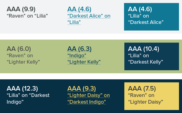
A Simple Sample Illustration Case
The next step is to find a good color option for buttons and links (the actions). I take a slightly different approach here.
Instead of going for “AAA”, I’m looking for “AA” (a reasonable standard to strive for). So that I can get a brighter color to contrast from the static text and draw attention to important links. For these purposes, I’m testing “White” (#FFFFFF) in combination with various colors.

In my case, the blues and reds have a higher success rate while the yellows and greens not so much.

I go with “Darkest Alice” (#107896) for a good combination of contrast and luminosity. “Ruby” (#C02F1D) is also a decent option.
It’s also good to identify some additional color combinations too. Especially, for attention-grabbing call-outs and other possible needs.

In the illustration above, my base example is with dark gray “Raven” text and a bright “Darkest Alice” blue for links and buttons.
Below is another example with darks on a lighter background.

Here is another example with lights on a darker background.

As you wrap things up…,
Of course, the last step is to keep a reference guide handy with your test results while adding notes to your style guide.
Your clients and audience will be impressed that your colors are chosen for thoughtful reasons — optimal readability. And you’ll sail through QA testing with additional options should you need them.
The illustration above is sample documentation for a style guide. That’s really all there is to it, but you could break this down into three even simpler chunks if you like:
- Reading Text: For reading purposes, find a high contrast pairing for most of your body copy (the heavy lifting).
- Action Links: For links, explore colors that are both luminous and high contrast to make it clear where actions are. (If you’ve done this right, there will be some contrast between your reading text and action links.)
- Extra, Extra!: Create and document various color combinations for call-outs intended to draw extra attention.
NB: This article is part of a series on color as it relates to designing for the web. For more in the series, check out these articles:
- Using Word Association to Select Brand Colors
- Add Colors To Your Palette With Color Mixing
- Shades of Gray — Yes, Really
- Giving Colors More Colorful Names
- From Darkness to Light: Color Versatility Using Tints, Tones, and Shades
- Signal vs. Noise: Color as a Wayfinding Tool
- Using Visual Loudness for Better Wayfinding
- Design Systems at Viget
That’s all you needed to know in terms of color contrast for better readability!
Takeaway,
We all know that Website Graphics Design & Development is the norm of the 21st Century. In fact, according to the Social Science Research Network, 65 percent of the population are visual learners. Of course, which means that they heavily rely on images and video gestures.
Particularly, to do their heavy lifting when it comes to communication and information gathering. While photos have their uses, you should also consider the possibilities in the vast world of Website Graphics Design.
On one hand, photos tend to be one-note: they show a product, a person or group, or scenery. So, they’re good for your aesthetic design. But, don’t serve as strong content on their own. Therefore, utilizing the basic website graphics design is lucrative to your Website Appearance in general.
Related Topic: How to Design Ad Graphics | A Step-by-step Novice Guide
On the other hand, having a team of webmasters in graphics design and development is adept in visually improving your general brand reputation. Not to mention, the reputation your website creates for your visitors increases the chances of new leads.
Also, the conversion rate of potential customers is equally high. With the color contrast guidelines above, you now have an added advantage. In addition, you can check out W3C audio guides for a more thorough explanation. You can also, check out Contrast Rebellion for an interesting look at the contrast problem.
Finally, if you’ll need more help, you can Contact Us for more support. You can also share your additional opinion thoughts, suggestions, contributions, or questions in our comments section below this blog. I’m wishing you all the best!


I’m very happy to read this. This is the kind of manual that needs to be given and not the accidental misinformation that is at the other blogs. Appreciate your sharing this greatest doc.
You’re so welcome!
Keep posted for even more information in the future.
I see something genuinely special in this site.
Skincell Pro has actually been referred by some individuals as the suitable skin conditioner.
It is a preferred product which has all the required active ingredients
to make your skin smooth and even-textured. The lotion is likewise a scientifically verified formulation which assists improve your skin texture, even-toned,
and even-moisturize. I determined to utilize this item for myself
to eliminate the mole on my left ear. https://fatallisto.com/story9267473/skincell-pro-store