To meet all the standard requirements for the best dark UI background design, make sure that you follow this guide to the end. Whilst, keeping in mind, that the use of dark colors in terms of website design is one of the hottest design trends — it’s the cause of so much debate. Most web designers have already adopted this style for big brand company sites.
Whilst, believing that it gives a unique impression of high quality. However, others think dark colors can create a somber tone and be less easy to read — that’s in comparison to much brighter colors. Indeed, yes, using dark colors in website design is not appropriate for every industry. But, if done well with the right color scheme, a dark website can stand out.
Especially, from its target crowd, and reach its audience effectively with good readability. Furthermore, we still believe that it can come across as creative, and even bring out other beautiful ideas in reality. But, dark themes can be dramatic and elegant, but crafting them comes with many hurdles and potential pitfalls. Thus, the need for a guide like the one below.
In simple terms, following the principles of dark UI background design (which we are going to look at herein in a short while) can help design webmasters achieve successful results.
Why Color Contrast In Web Design Matters
If you want to know why color contrast is so important in web design, you should look no further than how even big companies like Google utilizes them. Especially, while merchandising some of their topmost web platforms and applications. At its core, checking for good resultant color contrast in your graphics design is very important for optimal readability.
Moreover, when you create color palettes for your web design projects, chances are that you’re testing the color combinations for great contrast. If you’re not testing the color combinations of your designs, you might not be considering the eventual readability of the design. And thus, you’ll be losing the very potential audience you target.
Some web users — if not all — are quite sensitive when it comes to the choice of design colors. In web design, Color Contrast is the difference in light between the font (or anything in the foreground) and its background. So, in terms of web accessibility, how well one color stands out from another color determines whether or not most people will be able to read.
On the other hand, the Color Contrast Ratio is the numerical value assigned to the difference in light between the foreground and the background. And in terms of web accessibility, the color contrast ratio is how contrast is actually measured. All this is possible because colors on the web, colors are generated through unique codes.
While providing a way to accurately analyze and compare those codes against each other, resulting in a ratio. Usually, graphics are used for explaining things and ideas that are not expressed by words. For this reason, we’ve been working on a very unique color combinations process. In order to help us ensure good color contrast and readability in all our web projects.
What A Dark UI Background Design Entails
A Dark UI Background Design (Dark UI Design) is a term used to refer to a web-based application layout interface that uses mostly dark backgrounds and elements to create a ‘dark’ color scheme. In most cases, dark interfaces can be the only color theme for a given website or application or can be toggled on (in our case) easily through customizable settings.
Dark UI designs are seen far and wide, from mobile screens to massive TVs. A dark theme can express power, luxury, sophistication, and elegance. However, designing for dark UIs presents multiple challenges and won’t meet expectations if implemented poorly. Before diving into the “dark side,” designers should look before they leap.
Resource Reference: How Dark Mode Works | A Readers Mode Helping Save Eyes
On one hand, one of the key benefits of implementing a strategic dark background UI design plan is that it can help save battery life. More so, by reducing the amount of power used to show an interface. And, as such, it can greatly help reduce eye strain by adjusting to surrounding lighting conditions and can help facilitate the use of devices in dark environments.
On the other hand, the other benefit is that colors play an extremely significant role in any end results of a website design project. For one thing, it can influence your public’s attention, and interest to greater heights. Meaning, that if a customer doesn’t like the look of your website it is very likely and possible that they’ll leave and never return.
When Should Webmasters Utilize A Dark UI Design?
Of course, yes! The dark mode is not a new idea. It has been around for a long time, but only recently have sites and apps started implementing both a dark and light mode for their UI. Back before dark mode was a thing, sites that choose to have a dark UI did so either because their apps and websites were going to be used in dark environments.
Or rather because they wanted to create a moody dramatic effect. Physicists say black isn’t really a color; it is the absence of light. In his experiments shining sunlight through prisms, Sir Isaac Newton didn’t even include it on the spectrum of colors. In color psychology, most colors represent different things for different people.
Resource Reference: In the Spotlight: The Principles of Dark UI Design
In Western cultures, black is often associated with death, mystery, and evil. Green is often associated with growth because of nature. Blue is almost universally calming because it’s associated with the sky and water. So, when it comes to UI and UX Design, we can clearly say that color plays an emotional aspect while other effects are cultural.
Purple, for example, is still associated with luxury because, in many ancient cultures, purple dye was expensive and rare—only royalty could afford it. It was a significant part of the cultural zeitgeist for long enough to become a part of the human psyche. Digital products with dark UIs — associated with power, elegance, and mystery—are a formidable trend.
While it’s often said that dark mode can reduce eye strain, there is no evidence that this is true. Under certain circumstances, it’s also supposed to save battery life. Still, more often than not, dark themes are an aesthetic choice.
The Topmost Best Colour Testing Tools To Consider
We are quite sure you now know some of the benefits of Color Contrast in Web Design. So, the next thing now is to start implementing your own HTML color codes that are so unique. HTML color codes are hexadecimal triplets representing the colors Red, Green, and Blue (coded as #RRGGBB in formatting).
For example, in the color red, the color code is #FF0000, which is ‘255‘ red, ‘0‘ green, and ‘0‘ blue. These color codes can change the color of the background, text, and tables on a web page. But, before you even start implementing your scheme, you need to fully understand how RGB Color Codes Chart works for beginners.
But, what color models are the most common in media? Basically, there are many different color models — all of which aim at different aspects. The four most common color models are RGB, CMYK, HSB, and HEX. Whereby, RGB is based on Red, Green, and Blue and is used for computer displays. So, how do we choose our graphics design colors?
Resource Reference: Why Is Color Contrast In Web Design Important? Start Here!
Well, we normally talk of RGB color space. The RGB color space or RGB color system constructs all the colors from the combination of Red, Green, and Blue colors. The Red, Green, and Blue use 8 bits each — with integer values from 0 to 255. This makes 256*256*256 = 16777216 possible colors. Where RGB ≡ Red, Green, and Blue.
Each pixel in the LED monitor displays colors this way, with a combination of Red, Green, and Blue LEDs (light-emitting diodes). When the red pixel is set to 0, the LED is turned off. When the red pixel is set to 255, the LED is turned fully on. Any value between them sets the LED to partial light emission. Below are the basic tools to help you lay your scheme plan.
Choosing The Right Website Color Tool
The truth is that: Getting a color scheme right is a basic skill for any web designer. Of course, yes, choosing the base color is not difficult, but the real challenge is to get the right set of color combinations. Many designers will, therefore, use color tools to arrive at the best color scheme. Fortunately, there are many color schemes and tools out there.
However, some tools are designed to be used in specific ways, while others can only meet certain specific needs. For beginner webmasters, this color tool collection from the creative blog has information for web designers in all design scenarios. Likewise, below are a few more suggestion tools that you can consider giving a try in your next projects:
1. Adobe Color Contrast Analyzer
This tool helps you check the contrast between the background and text or graphic components’ design color.

As you can see, you just have to add a color for the text and one for the background (left) to see how the contrast works (right).
2. Colorblind Web Page Filter
This is a tool that helps you see how the website looks to people with different types of color blindness.

Similarly, as you can see, you have to introduce the URL of the page (1), select an anomaly (2) and see how the page looks like (3) for people having that anomaly.
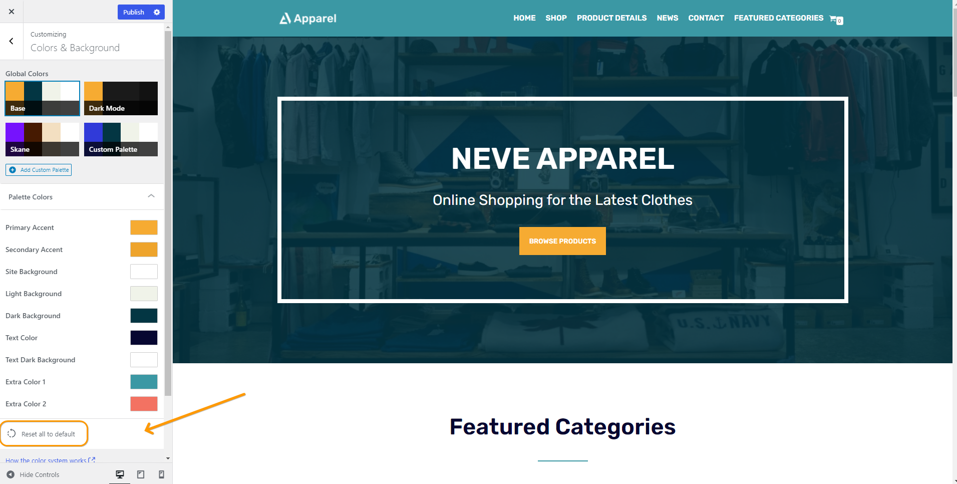
3. Neve Theme Global Colors Option
In our case, since we use Neve WordPress Theme for our website, you can also use the new Global Colors option in Neve — so you can easily create a beautifully unified color palette on your WordPress website. On that note, if you too are using this unique theme for your WordPress website, you can follow these simple steps to effectively manage your color options.
For your information, the Neve WordPress Theme comes with two base color palettes, that can be used right away: Base Mode and Dark Mode to be specific. You can even create your own palettes and apply them sitewide. What’s more, each color palette consists of nine colors, that apply across your site, and can be customized to match your taste.
Consider the following:
- Primary Accent – Button color, link color
- Secondary Accent – Hover color
- Site Background – The default background color of the site
- Light Background – The background color of the surfaces that have a light background
- Dark Background – The background color of the surfaces that have a dark background
- Text Color – Default text color (readable for site and light background)
- Text Dark Background – Text color (readable for dark background)
- Extra Color 1 – Background color for sale tag, Positive Cart Notice
- Extra Color 2 – Background color for Negative Cart Notice
If you want to come back to the initial state, click on the Reset all to default button.
And now, as long as you utilize the best color options, we should be able to clearly see a notable difference: Between the above image above (base mode) and the below image (dark mode).

It’s also, worth mentioning, that with Neve you can also create your own custom color palette, starting from one of the two bases. Meaning, that you can have a new color palette, that can be customized to fit your taste. To get started, all you’ll need is to select the color of your choice for each option of the palette and then publish the changes.
4. WordPress Editor (Gutenberg) Global Colors
For a completely unified color palette across your website, consider individual posts or page content. Neve’s global colors can easily be applied in the Gutenberg Editor, for each individual block. The colors from the current color palette are automatically selectable from each block’s color options. Just click on the color of your choice, or use a custom color.
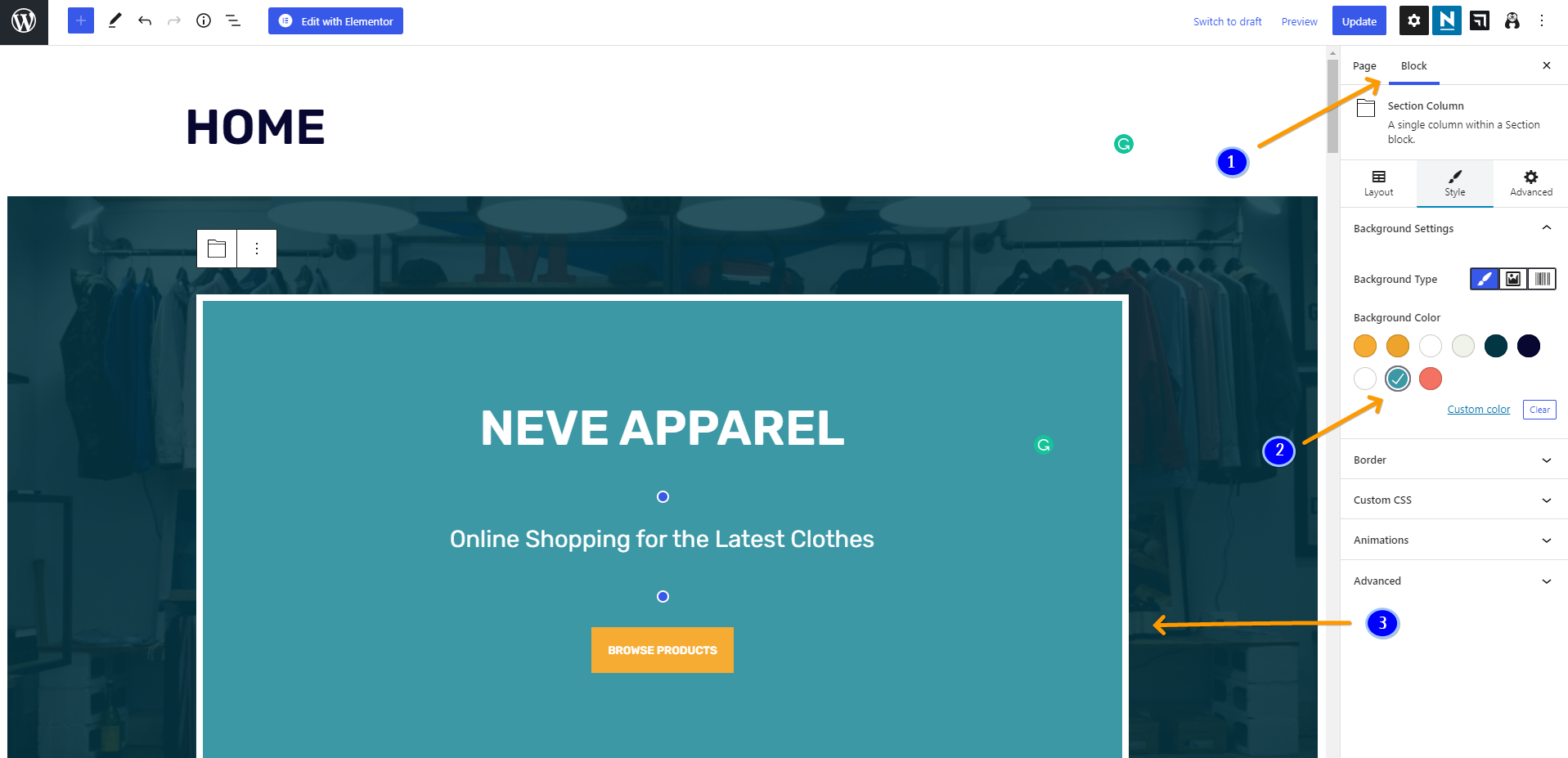
5. Elementor + WordPress Customizer Global Color Options
Important to realize, Neve’s Global Colors are directly integrated with Elementor Page Builder as well. Whereby, when editing your page with the page builder, and when choosing a custom color for one of the elements on the page, you have two options:
1. To use one of the global colors from the current color palette
- To have access to the global colors, click on the little globe icon (1) in front of the select colors option and select the color of your choice. You will see there all global color options coming from Elementor itself, but also the global colors coming from Neve. To easily recognize them, all colors coming from Neve, have the word Neve attached to their names.

2. To use a different custom color
- In this case, just click on the select colors option near the little globe icon.

Last but not least, the global color option in your WordPress website is the last destination to seek customization features — that’s if everything fails, seems not to work, is too technical, and the like. And, just as their name suggests, global colors from the color palettes can be used globally across your website — each theme has its own customizer settings.
When selecting the color of your choice for (most) elements in your Customizer Dashboard, you have two options.
Consider the following main options:
1. To use one of the default global colors from the current color palette
- To access the global colors, click on the little globe icon in front of the select colors option to select your color choice.
2. To use a different custom color
- In this case, just click on the select colors option near the little globe icon.
Be that as it may, in this example, we can use one of the global colors from the Neve Theme color palette, for the Button component. This means, that any change done to that color in the color palette will automatically apply to the button — this will eventually keep the overall website outlook consistent across all pages.
As you can see, there are plenty of good color contrast testing tools available on the web. Just go ahead and find one that works for you and use it to test background and foreground color combinations.
The Topmost Dark UI Background Design Best Practices
In general, you can also use HTML Color Picker from W3Schools to pick any color code from an image or website URL. An Image Color Code Picker is a color code picker tool that allows webmasters and graphic designers to grab the color palette from an image for free. It allows anyone — even if they’re beginners — to upload an image on the web platform.
And, as a result, they’ll get the unique color scheme used on the image uploaded. This means, that you can pick the dominant and primary colors! Extract and find the desired color you are looking for. Additionally, with this simple web color picker tool, you can upload another picture and get the RGB, HEX, and HSL color code of the pixel without installing software.
While you can use color contrast tools to help you establish a color palette, you can also use the tools to help find good options within an existing palette. That aside, there are a few things to always, keep in mind, when creating an interface with a dark color pallet that differs from interfaces with a light color pallet. Let’s have a look at some of them below…
1. Make sure you avoid using pure black
When picking a background color and a text color you may immediately go to pure black for your background and pure white for your text color. However, this has a very harsh contrast and can make text difficult to read and even painful to the eyes after a while. Instead, use a dark grey color for your background, as per Google’s material design guidelines.
Perse, Google recommends using the color #121212. Obviously, dark grey allows you to use black for shadows — so you can keep a sense of depth and has a reduced contrast between itself and white text which will reduce any form of Computer Vision Syndrome (CVS) or rather, what most learned fellows will simply call an eye strain.

2. Always try to use hues of white
When adding emphasis to dark text on a light background we generally use a heavier font weight or size. However, with dark backgrounds, light text can appear very bold already, and using a bold font may look heavy-handed. Instead, consider using a slightly off-white for elements that are not active or being interacted with.
An example of this would be using a slightly darker shade of white for input text on inputs that aren’t active or don’t have any content, then using a bright white for active inputs or inputs with content. This can help visually differentiate them from one another without adding overly bold text.
3. Steer clear of over-saturated colors
Always remember, colors that are very saturated can look very good on light UI interfaces as they have a good contrast ratio. However, on darker backgrounds highly saturated colors can cause eye strain and often don’t meet accessibility guidelines. Less saturated colors are generally better fall-round in terms of legibility on dark backgrounds.
If you have very saturated colors in your brand pallet and want to ensure brand consistency you can use these saturated colors but they should be kept to a minimum throughout and substituted with a less saturated version of those colors when possible.

4. Adjust your color pallet where necessary
Surprisingly, there are similarities in how many users perceive the use of color on websites. As an example, if a website appears too cluttered, with many colors, the user will not enjoy the experience. So, the choice between dark or light color schemes for the main color on your website needs to be judged very carefully. Use a color pallet only when need be.
For instance, if you have an existing color pallet that is used for a light interface and you are now adding a dark interface option you will need to revisit your color pallet and potentially adjust it specifically for your dark UI. As mentioned above there are some colors that can look great on light UIs but won’t meet accessibility on dark UIs.
The first thing you can do is check your existing layout color contrast against your proposed background color. If it meets accessibility requirements then you are good to go, but if it doesn’t meet accessibility consider reducing the saturation.
5. Use different shades to indicate the depth
When creating your User Interface (UI) Design you shouldn’t feel the need to stick to just one shade of grey for the background elements. In fact, this may be impossible if you use cards, modals, or drawers in your designs. Picking a base shade of grey is your starting place, from there you can add a few more grey tones to gradually increase brightness.
Essentially, elements that are elevated above the main background can use these slightly lighter greys to express depth in your designs. Therefore, the higher the elevation of the element, the lighter grey the background becomes.

6. Keep your pallet minimal
Realistically, the purpose of a dark UI background design is to reduce eye strain by keeping the majority of the items on the screen dark. This means, that you should try to limit your color pallet to only a few colors and try to use these colors as a highlight and accent colors only. That said, the majority of your screen real estate should be dedicated to dark greys.
Similarly, bright colors can be fun and eye-catching. Using them against dark backgrounds on websites can make the sites more interesting and lively, creating a more striking visual effect for the user. But, to maintain cleanliness and to keep the feeling uncluttered, designers should stick to more limited, even minimal, color schemes.
7. Give users the option to turn it on or off
By all means, if you have an application or website with both dark and light UI you should ensure there is a way for the user to control these settings from within your product. This may seem like an obvious one but relying on the users’ device settings to change your product from light to dark reduces user control. It could be that they prefer using your website in dark mode all the time and giving them the freedom to choose to do so will greatly improve their happiness while browsing.

8. Test your design with both light and dark UI
If you have created a design in light mode, tested it, and maybe even released it to customers to use, and now you have created the dark mode for that original design, don’t forget to test it. The fact the interface worked well in light mode is no indicator that it will work well in dark mode. Changing colors and contrast can make some items less accessible.
And, this can be easily checked by conducting some usability tests prior to launching your design. Remember, there is also nothing like the pleasure of visiting a website with eye-catching animation. So, as you test your layout design, make sure that you also try to integrate some animations in between and see how it comes out.
9. Use visible color fonts for Headings, Titles, and Labels
Readability is the number one concern for people who don’t like dark colors on websites. So web designers need to pay particular attention to the text and how it appears. Using bold, clearly visible color fonts on headings, titles, and labels is an easy way to attract people’s attention and get them to focus on the websites’ content and branding.
Against dark backgrounds, white is always the first choice for many designers here. But, for longer paragraphs or blocks of text, white on a dark background should be avoided as it can strain the eyes and thus affect readability. That’s why, in such cases, gray fonts are known to always work much better.
10. Dark websites should always use white space
Dark color schemes can make websites appear “heavy” or “oppressive”. Careful use of white space can make each element on the page easier to understand. White space is the most common element in web design, especially against dark backgrounds and its use is essential to help highlight the main content.
The more white space you have, the more space you can spare for fonts and the main content, all of which can guide the user smoothly through the site. If there are too many elements, the user’s attention will be dispersed. White space allows users to find the information they need as quickly as possible. Overall, it can improve the user experience.
A Few Dark UI Background Design Examples In Action
In the realm of the Digital Online Web, there are just so many examples of websites and application platforms that we can specifically borrow a few ideas from. Especially, those that utilize an always-on dark mode — some are; apps to help you sleep, Netflix which is mainly used in the evenings, and games where you want to create a moody atmosphere.
To enumerate, let’s consider Netflix in this case — it uses dark UI to emphasize its content and reduce eye strain for people watching in the evenings. It even uses dark UI on its commercial website to add a sense of drama.

Also, if you consider a social networking platform like Reddit, it has a dark mode in which users can toggle on and off themselves from a menu. Specifically, they utilize different greys to add depth to their design and change some colors to more muted tones for dark mode. Medium also utilizes the dark UI background design in its unique platform quite so well.
Whereby, Medium offers you option tools that can be set to match your device settings — so that in the evening you aren’t blinded by a bright white screen. Whilst, allowing you to read without straining your eyes. That’s not all! One thing is for sure, there are so many websites and application platforms that utilize this strategy in their design projects all too well.
Consult Our User Interface Design Webmasters
We all know that website design & development is the norm of the 21st Century. In fact, according to the Social Science Research Network, 65 percent of the population are visual learners. Of course, which means that they heavily rely on images and video gestures. Particularly, to do their heavy lifting when it comes to communication and information gathering.
While photos have their uses, you should also consider the possibilities in the vast world of website graphics design. On one side, photos tend to be one-note: they show a product, a person or group, or scenery. So, they’re good for your aesthetic design. But, on the other side, they don’t serve as strong content on their own. So, be wise when laying out your plan.
All in all, utilizing the basic website graphics design is lucrative to your website appearance, particularly, in order to provide an overall great User Experience (UX) to your target audience and potential audience in general. In that case, whatever the reason or the need is, our team of Web Tech Experts is always ready to help and support you in any way.
Just get in touch with us at any time and let us know how we can come in handy — we’ll be more than glad to sort you out. You are also welcome to share your additional thoughts, opinions, suggestions, recommendations, or even contribution questions (for FAQ Answers) in our comments section. And now, until the next, thanks for taking the time to read this guide.