Of course, you may have interacted with Website Application Wireframes in one way or another without even knowing it. However, the truth is that most website users and amateur application developers do not fully understand their role in their design and development processes. As a rule of thumb, during the wireframing process, wireframes save you time and adjustment work later.
A wireframe is a schematic, a blueprint, practical to help you and your programmers and designers think and communicate about the structure of the software or website you’re building. In layman’s language, website application wireframes help get your message across. These wireframes help you nail down the interface—resulting in easy-to-use software, applications, and websites.
Realistically, nailing down a good interface structure is possibly essential for any website or application design and software development project. Doing this before any code is written and the visual design is finalized will save you time and painful adjustment work later. It’s important to remember that wireframes guide where your primary navigation tabs for the website will fall.
In addition, it also helps focus on how the application content and specific software platform elements will appear on the page. Realistically, with the help of an application tool, such as the Mockplus Cloud, design specifications, measurements, redlines, assets, and code snippets are auto-generated for all platforms like Web, iOS, and Android. They are easy to inspect and ready for export.
Understanding What Website Application Wireframes Entails In Wireframing
Regarding wireframing, Website Application Wireframes is a two-dimensional illustration of a page’s interface that specifically focuses on space allocation and prioritization of content, functionalities available, and intended behaviors. Wireframes typically do not include styling, color, or graphics for these reasons. They also help establish relationships between a website’s various templates.
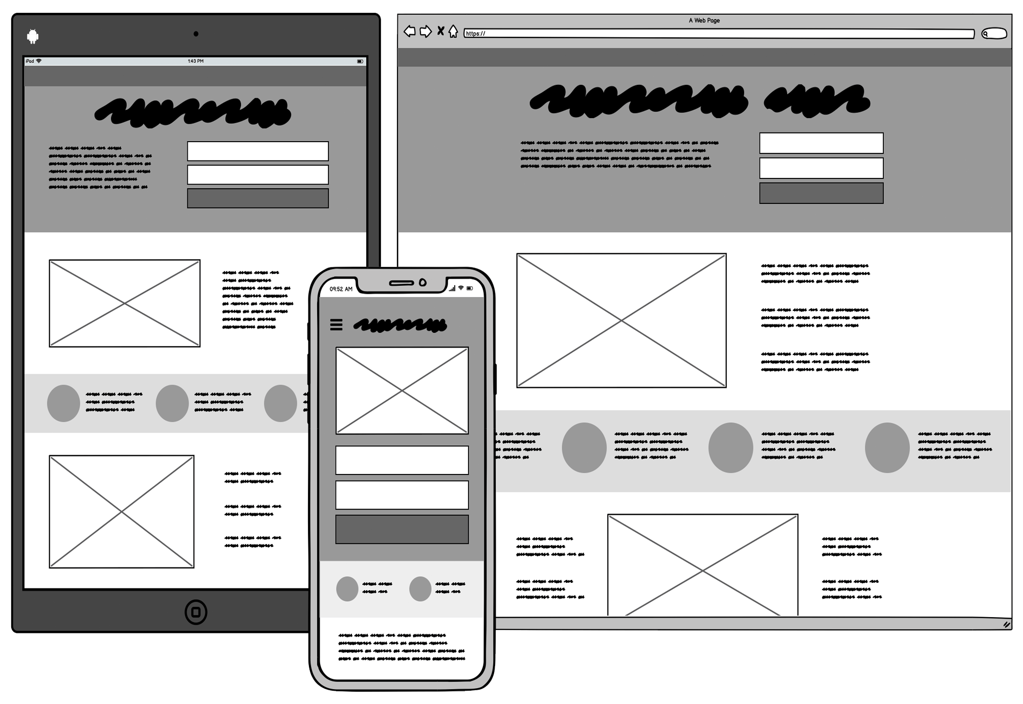
In other words, a wireframe is a schematic or blueprint helpful in supporting you, your programmers, and your designers to think and communicate about the structure of the software, the website, or the application platform you’re building. Thus, the designs you receive are called website application wireframes (sometimes called wires, mockups, or mocks), as shown in this image below:
Sure, the illustration image above shows three rough wireframes of the same content as it may appear on a mobile phone, a tablet, and a computer. Of course, the same screen can be built in many different ways, but only a few will get your message across correctly and result in an easy-to-use software or website. There are various reasons why most design developers choose them.
With that in mind, you can read more about the two phases of wireframing, watch the detailed wireframing video for newbies to gather more helpful information, or follow our quick summary guide below. Be that as it may, website application wireframes typically have an intentional low-fidelity look and feel. Most web designers and application developers provide some of the notable reasons.
They serve these purposes:
- To make it clear that no project design code has been written yet
- Ensure that they make it clear that this is not the final website or application design project.
- Connect the website’s information architecture to its visual design by showing paths between pages.
- Clarify consistent ways for displaying particular types of information on the user interface.
- Determine the intended functionality in the interface and convey that “this is all up for discussion.”
- Prioritize content by determining how much space to allocate to a given item and where that item is located.
Wireframes are quick to make, so don’t be shy about giving feedback on any mockup design! Each screen probably only took a few minutes to make; don’t worry, their author won’t mind doing them over from scratch. The final ease of use matters most, so going through a few iterations is typical and expected. This helps to streamline your entire site or app product design workflow.
As you can see from the illustration image above, if your customer or stakeholder received some screens that looked like screenshots of the final application platform instead of a wireframe, they might assume that all the code behind those screenshots had already been written. But this is often not the case—website application wireframes don’t pose this danger.
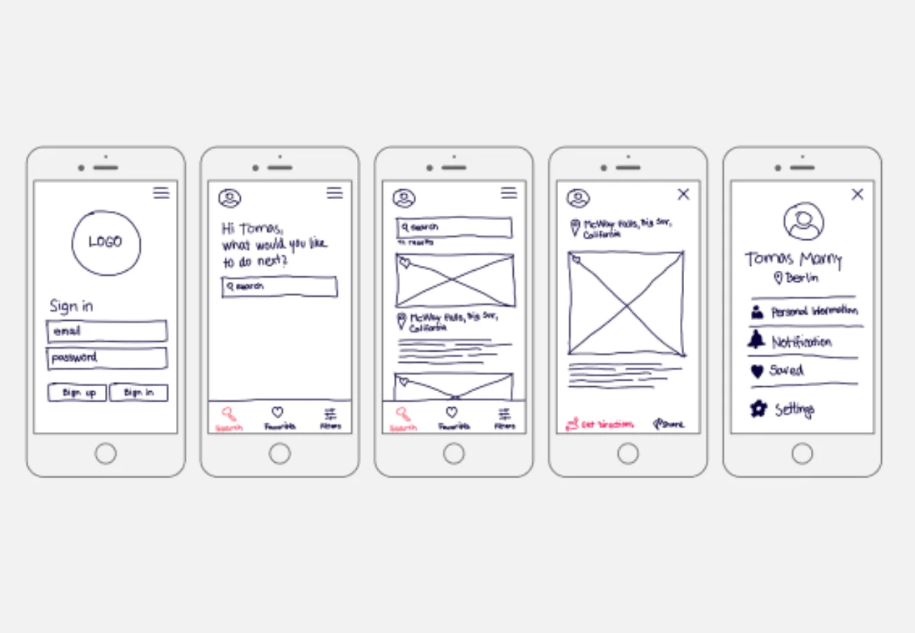
It’s important to realize that wireframes can vary in production, from paper sketches to computer-drawn images, and in the amount of detail they convey. Low, medium, and high-fidelity are used to identify the wireframe production or functionality level.
The main wireframes:
- Low-Fidelity Wireframes: They help facilitate project team communication and are relatively quick to develop. They tend to be more abstract because they often use simple images to block off space and implement mock content or Latin (lorem ipsum) text as filler for content and labels.
- Medium-Fidelity Prototyping: This kind of prototype is usually digital and provides some of the critical functionality and content used in the product. It has clickable parts that present the interactions and navigation possibilities.
- High-Fidelity Wireframes: These are better for documentation because of their increased level of detail. These wireframes often include information about each item on the page, including dimensions, behavior, and actions related to any interactive element.
Realistically, these free design collaboration and handoff platforms simplify designer-developer workflow into a link. Remember, a design process is a series of steps a product team goes through to create a product. The process typically starts with an idea of a future product, and the product team turns this idea into a fully functioning product. Prototyping is one of these main steps.
How Prototyping Helps Power The Website Application Wireframes Design
Prototyping is one of the most critical steps in the project design process because, during this step, the product team makes the idea tangible so other people can interact with the design. Technically, the definition of prototyping may be different in different fields. But if you return to its roots, you will find that the word prototype comes from the Latin terms proto (original) and typus (model).
So, the name already gives it away. On the one hand, a prototype is an interactive version of the design, a model of a future product with which other people can interact. However, a prototype is not a sketch, wireframe, or mockup; those are static design artifacts. On the other hand, a prototype is created using sketches, wireframes, or mockups—by turning them into interactive assets.
Gaining stakeholders’ approval on design is an integral part of any design process. Without stakeholders’ approval, the design team won’t be able to create a product. It’s possible to communicate ideas to stakeholders in many ways, yet visual communication is the most effective. People are visual learners; when they can see and interact with an actual design, they can provide detailed feedback.
A prototype will give stakeholders a clear idea of how the future product will look and function. Prototyping will also help to avoid confirmation bias, one of the most dangerous things in product design. Many product creators favor information that confirms their beliefs or ideas and ignore all other information. As a result, they build a product for themselves rather than their target users.
The Topmost Best Practices For Creating Website Application Wireframes
There is no need to say that such products can quickly fail on the market. Prototyping will help to prevent that because this practice constantly makes the team validate their design decisions with users. It’s imperative to validate your design when you work on innovative design and want to introduce novel design patterns. Prototyping will help you to streamline the development process.
Prototypes can also help to evaluate the technical feasibility of the design. Not all that designers create can be easily turned into code. The engineering team can review a prototype and find areas that will be hard or impossible to implement. It’s recommended to use collaboration design tools so that design and development project teams can interact with each other during design handoff.
However, prototyping can move user research to the next level, making research much more focused. For example, when designers create a new page, they always think about the order in which to show content. They wonder how content should be categorized and labeled on the page. Content should always be classified according to the user’s expectations and the best way to learn.
More so about expectations is to conduct card-sorting exercises. By letting users group information in a way that makes sense, the team will create a much better user experience. The same approach works well when the team wants to improve the conversion rate. “Test early, test often”is one of the main rules in product design. Ensure your wireframes address some of the two vital questions.
Such as follows:
- One, how can we solve our customers’ problems?
- Two, how do I know if this idea solves it?
As a rule of thumb, if you want to demonstrate a design to stakeholders, always share high-fidelity prototypes because it will help you solicit the most detailed feedback about your solution. By so doing, stakeholders can evaluate visual language (visual styles such as font and color selection) and content. Product design typically starts with user research to identify and learn the target user.
Wireframing is more than just a way to sketch an idea on your computer. It is used often because it helps answer 2 common questions software builders face. These questions can be split into 2 distinct phases: the ideation and validation phases. Since the goal of the illustrations is not to depict visual design, keep it simple. In that case, there are a few factors for you to keep in mind.
They include:
- Do not use colors. If you would typically use color to distinguish items, instead rely on various gray tones for differences.
- Do not use images. Images distract from the task at hand. To indicate where you intend to place an image and its size, you can use a rectangular box sized to dimension with an “x” through it.
- Use only one generic font. Typography should not be a part of the wireframing discussion. Within the wireframes, however, you may still resize the font to indicate various headers and changes in the hierarchy of the text information on the page.
Prototypes will serve as live documentation to help the engineering team properly implement the design. In addition, prototypes are especially valuable when the engineering team needs to develop a complex effect, such as an animated transition. In layman’s language, design is a team sport, and prototyping is one of the exercises that teams can (and should) practice together.
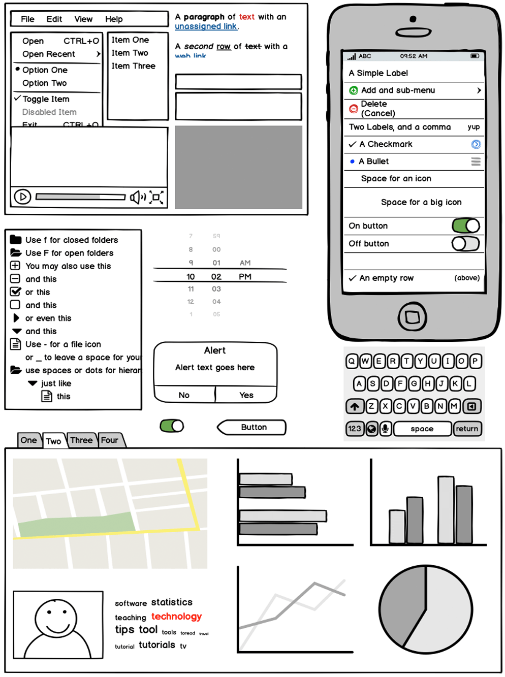
Since wireframes are two-dimensional, it’s important to remember that they don’t do well with showing interactive features of the interface, like drop-downs, hover states, accordions that implement show-hide functionality, or auto-rotating carousels. Although wireframes differ from site to site, the following elements are often included as standard elements on wireframes.
Including:
- Business Brand Logo
- Custom Search Fields
- Navigation Breadcrumbs
- Headers, including page title as the H1 and subheads H2-Hx
- Navigation Systems, including global navigation and local navigation
- Body Content
- Share Buttons
- Contact Information
- Footer Layout
The earlier we validate our design decisions, the more issues we will avoid. In that case, prototyping plays an integral role in design validation. Creating a fully-functioning product takes a lot of time and can be very expensive, but creating a prototype with only essential elements is much easier and cheaper. Product teams create prototypes and use them during usability testing sessions.
Test participants interact with prototypes and complete tasks that resemble real-world scenarios. The product team collects usability testing results, analyzes them, and understands what parts of the design work well and what requires refinement. Product design is an iterative process. Once the team validates the design and gains valuable insights about user behavior, they use the insights.
In particular, it helps them create a new prototype version and again conduct testing. The team will follow the prototype-validate-learn cycle until they make a design that works well for the users. Prototyping will help you to understand how quickly users can learn how to interact with your product and what additional assistance they need. Prototyping helps in the onboarding process.
Quick Wireframing Tips:
- Understand users’ needs and explore solutions: Before starting the prototyping phase, you have to research your target users, define their needs and problems that need to be solved, and then come up with as many possible solutions as possible.
- Create solutions with prototypes: Now, after you have clearly understood your target users’ needs and come up with solutions, it’s time to create prototypes to identify the best possible solution for each of the problems identified.
- Prototype testing and refining: Once you’ve created a prototype, you’ll need to put it in front of real users and test its functionality and compatibility with different devices and platforms. You’ll observe how they interact with the product in its current state and ask for feedback on how the experience feels.
No one could mistake a wireframe for your application’s last look and feel. Low fidelity and few colors force you to focus on structure over details. There will be lots of time for visual design once the system is finalized. As mentioned, wireframes also help convey that “this is all up for discussion.” The rough feel encourages discussion—we call it a look no one is afraid to criticize.
In a nutshell, prototyping is an essential part of the product design journey. It can help the team avoid severe design mistakes, create user-centered products, and improve team spirit. However, it only happens when the team has a clear strategy for prototyping. Sporadic prototyping won’t give a team much value. Prototyping should be naturally integrated into the project design process.
Getting Started With Rapid Interactive Wireframe Prototyping In Mockplus
When designers want to persuade users to take a particular action (for instance, click on the ”Start For Free” call to action button), they will try to learn more about factors that can impact the user’s decisions. The product team conducts user interviews and field studies to understand what can motivate users to click the button. Remember, product design is a complex process.
There are many things that the product team needs to consider when building a product, and it’s relatively easy to forget something. It happens because the product team often works with static mockups rather than prototypes. Prototyping helps the design team shift focus from static screens to an interactive experience. When a team starts to create a prototype, they can think more.
They think more about how users will interact with individual screens and likely notice gaps in the design. Let your design team members understand why and how they create prototypes is best. Uncover everything you need to know about web and mobile app prototyping, including basics, insider tips, current trends, and up-to-the-minute news with Mockplus, and start your project now.
By working together, we can create truly remarkable products. Mockplus brings your teams together for seamless prototyping, testing, iteration, and scaling—all in one platform. Designers, developers, project managers, and stakeholders can work in sync and achieve success together. Its templates are fully customizable, so you can easily create structures, forms, and images in minutes.
In Conclusion;
While it’s possible to conduct usability testing with paper or digital prototypes, digital prototypes are better because they allow test participants to interact with the design without extra help. Also, the higher your prototype’s fidelity level, the more detailed feedback you can collect from the testing. When test participants interact with high-fidelity prototypes, they don’t see any difference.
Especially between an actual product and a prototype. Still, while it’s possible to write a paragraph explaining the ease curve and timing of the animated effect, a textual description might not be enough for the engineering team to understand how this transition should work. “A picture is worth a thousand words.” Sure, developers can see the animation effect rather than read about it.
As such, they have much better chances of implementing it as intended. It allows them to communicate design decisions in real time and find more feasible solutions. While creating a prototype alone is possible, the outcome will be much better when specialists from different domains participate in this activity. Designers, sales & marketing experts, and developers have other ideas.
Their perspectives on design are pretty different, and when they work together on a prototype, they will enrich the design with their expertise. Another reason why it’s essential to invite people from different departments is because it helps create a sense of ownership. When people feel responsible for a product, they are more motivated to make the most to create the best products.


It’s very trouble-free to find out aany topic on net as compard to textbooks, as I foujd this piece of writing
at this web page.