The good news for all webmasters is that there’s already a new update rolling out in regards to the Google Page Experience that began in August 2021. The update started slowly rolling out to all users globally. Whereby, by Thursday of June 2021, Top Stories had already begun using the signal. According to an announcement seen by the SEJ, the company stated the following:
“We’ll begin using page experience as part of our ranking systems beginning in mid-June 2021. However, page experience won’t play its full role as part of those systems until the end of August. You can think of it as if you’re adding flavoring to a food you’re preparing. Rather than add the flavor all at once into the mix, we’ll be slowly adding it all over this time period.”
Google first announced back in November 2021 that the page experience update was scheduled to go live this year (2022). Since then, much information has come out regarding what will be included in the update. So, what is it really, and why does it matter to webmasters and web-based business owners. Well, let’s take a recap of what it all entails.
What Is Google Page Experience?
The Google Page Experience report provides a summary of the user experience of visitors to your site. Google evaluates page experience metrics for individual URLs on your site. And then, it will use them as a ranking signal for a URL in Google Search results on mobile devices. However, websites should not expect to see drastic changes as a result of this update.
For one thing, Google says that any sudden drops or spikes should be mitigated by the gradual rollout process. Of course, it may come as good news to site owners that Google hasn’t thrown in any surprises in the form of new features that weren’t previously revealed. The page experience update considers several signals that go into creating an optimal browsing experience for users.
Technically, Google assesses each of the signals and gives a website an overall ‘page experience’ score. Hereby, site owners can view their scores in the new page experience report in Search Console. With that in mind, below are each of the signals and what is required to achieve a “good” page experience score.
Consider the following:
- Core Web Vitals: See our guide to Google’s Core Web Vitals.
- Mobile usability: A page must have no mobile usability errors.
- Security issues: Any security issues for a site disqualify all pages on the site from a Good status.
- HTTPS usage: A page must be served over HTTPS to be eligible for Good page experience status.
- Ad Experience: A site must not use advertising techniques that are distracting, interrupting, or otherwise misleading users.
Eventually, if you’re not fully ready for the page experience update, Google’s advice is not to panic because the ranking signal is said to be a “tiebreaker.” It’s possible we’ll learn more about the page experience update as it continues its gradual launch, as it’s certainly too early to notice any impact from it.
The page experience update is now slowly rolling out (Top Stories will begin using this new signal by Thursday). It will be complete by the end of August 2021. More here: https://t.co/kDwhhOYklK
— Google Search Central (@googlesearchc) June 15, 2021
As part of this update, Accelerated Mobile Pages (AMP) is no longer a requirement for pages to be included in the Top Stories carousel. Not to mention, that change is already in effect as of early 2021. In addition, Google is expanding the usage of non-AMP content to Google News and removing the AMP badge icon from search results.
Important to realize, the page experience update currently applies only to mobile search results, but it will roll out to desktop at a later date. From the way Google describes it, the desktop launch is likely to happen much further down the road. Personally, I would not expect it to happen during the rollout that’s occurring between now and the end of August.
Why Make A Website Mobile-Friendly?
If not mobile-friendly, a site can be difficult to view and use on a mobile device. A non-mobile-friendly site requires users to pinch or zoom in order to read the content. Users find this a frustrating experience and are likely to abandon the site. Alternatively, the mobile-friendly version is readable and immediately usable.
According to recent research, in the USA alone, 94% of people with smartphones search for local information on their phones. Interestingly, 77% of mobile searches occur at home or at work, places where desktop computers are likely to be present. This’s the only way for creating moments that matter in the ever-growing and super fast technology-advancing era.
As you can see, in the illustration above, this is a very good example of a site that’s difficult to view and use on a phone. Compared with a mobile-friendly version. Perse, a mobile device is a very critical tool to any web-based business transaction.
Whether you’re blogging about your favorite SEO terms, working on the website for your community theater, etc. Or rather, selling products to potential clients. You should always make sure that visitors can have a good experience on your site. Especially, when they’re visiting it with mobile devices.
Getting Started With Mobile-Friendly Pages
It’s clear to say that the mobile is changing the world. Today, everyone has smartphones with them, constantly communicating and looking for information. For this reason, if you haven’t made your website mobile-friendly, you should consider doing so right away. Bearing in mind, the majority of users coming to your site are likely to be using a mobile device.
If you don’t know if your website is mobile-friendly, all you’ll need to do is take the Mobile-Friendly Test that’s quite fast and easy. Not forgetting, if you use a Content Management System (CMS) like WordPress to build your website, you are also very lucky. As such, to learn more, make sure you check out the Google guide to customizing your website software in detail.
Likewise, if you’re like many pro webmasters or are technical enough to do it yourself, you can get started by choosing a mobile configuration that best suits your needs. The work involved in making a mobile-friendly site depends on your developer resources, business model, and expertise. For an example of how a desktop site might be redesigned to work on mobile:
On a very basic implementation level, you can transition an existing desktop site to a mobile-friendly one. It entails using existing sections of content from the desktop site and organizing them in a mobile-friendly design pattern. For more information on the technical implementation of a mobile site, learn about the Mobile SEO configuration options in detail.
Mobile-Friendly Test Tool For Google Page Experience Signals
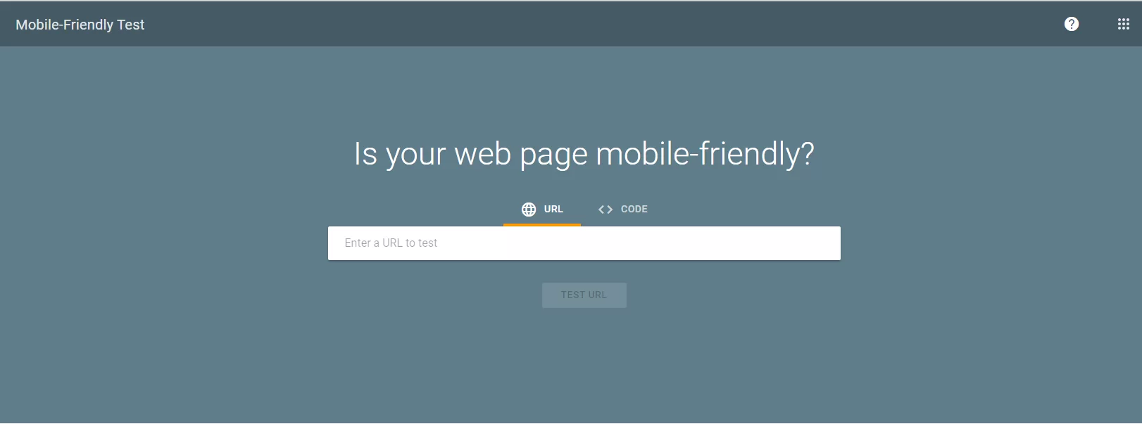
Nothing is quite satisfying than having a mobile-friendly website — it’s a critical part of your online presence. In many countries, smartphone traffic now exceeds desktop traffic. If you haven’t, you should make your website mobile-friendly, so to say. Search Console’s Mobile-Friendly Test Tool is a quick, easy way to test whether a page on your site is mobile-friendly.
The Mobile-Friendly test tool is easy to use; simply type in the full URL of the web page that you want to test. Any redirects implemented by the page will be followed by the test. The test typically takes less than a minute to run. Test results include a screenshot of how the page looks to Google on a mobile device, as well as a list of any mobile usability problems that it finds.
Mobile usability problems are issues that can affect a user that visits the page on a mobile (small screen) device. Including small font sizes (which are hard to read on a small screen) and the use of Flash (which isn’t supported by most mobile devices). This tool accesses the page as Googlebot (that is, not using your credentials, but as Google). Meaning, robots.txt file can easily block it.
The next thing is to see what mobile usability issues are detected on your entire site using the Mobile Usability report (which requires you to verify ownership of the site in Search Console). So, what mobile-usability errors does the Mobile-Friendly Test Tool identify? Well, the following are some of the usability errors that you can consider identifying:
#1: Incompatible Plugins
The page includes plugins, such as Flash, that are not supported by most mobile browsers We recommend redesigning your page using modern, broadly-supported web technologies, such as HTML5. Read more about web animation guidelines.
#2: Unset Viewport
The page does not define a viewport property, which tells browsers how to adjust the page’s dimension and scaling to suit the screen size. Because visitors to your site use a variety of devices with varying screen sizes—from large desktop monitors to tablets and small smartphones—your pages should specify a viewport using the meta viewport tag. Learn more in Responsive Web Design Basics.
#3: Device Width
The page defines a fixed-width viewport property, which means that it can’t adjust for different screen sizes. To fix this error, adopt a responsive design for your site’s pages, and set the viewport to match the device’s width and scale accordingly. Read how to correctly Set the Viewport.
#4: Screen Resolution
Horizontal scrolling is necessary to see words and images on the page. This happens when pages use absolute values in CSS declarations or use images designed to look best at a specific browser width (such as 980px). To fix this error, make sure the pages use relative width and position values for CSS elements and make sure images can scale as well. Read more in Size Content to Viewport.
#5: Text Font Size
The font size for the page is too small to be legible and would require mobile visitors to “pinch to zoom” in order to read. After specifying a viewport for your web pages, set your font sizes to scale properly within the viewport. You can read and learn more about font size as well as the best practices to Use Legible Font Sizes in detail.
#6: Clickable Elements
Touch elements, such as buttons and navigational links, are so close to each other that a mobile user cannot easily tap a desired element with their finger. Not without also tapping a neighboring element (clickable elements too close together). To fix these errors, make sure to correctly size and space buttons and navigational links to be suitable for your mobile visitors. Having said that, you can read and learn more about how to use Size Tap Targets Appropriately in detail.
On one hand, if for some reason the tool cannot access the page, it will display an error describing the problem. Access problems include network connectivity issues or the site is down. If a test cannot load all resources used by a page, you will get a warning. Resources are external elements included by the page, such as images, CSS, or script files.
This can happen for several reasons:
- First, if the resource wasn’t loadable in a reasonable amount of time. In this case, try running the test again. If it continues to happen, consider hosting the resource somewhere else, or else try to discover and fix the reason for the lack of response from the host.
- Secondly, the resource does not exist in the location listed (404 error). Fix the resource URL. Or rather, the resource is inaccessible to non-logged-in users. The test accesses the page as an anonymous user; ensure that all resources are accessible to anonymous users.
- Thirdly, the resource is blocked to Googlebot by a robots.txt file. If the resource is important (see below), if it is on your own site, you might want to unblock the resource to Googlebot; if it is on another site, you might want to contact the site’s webmaster and ask to have it unblocked.
On the other hand, if a blocked resource is important, it could have a big effect on how Google understands the page. For example, a blocked large image could make a page appear to be mobile-friendly when it is not, or a blocked CSS file could result in incorrect font styles being applied (for example, too small for a device). As a result, this affects the overall mobile usability score.
Additional Resources:
- How to work with a developer to fix your site
- Learn how to make your CMS website mobile friendly
- Learn more about designing mobile-friendly pages
By the same token, it also affects Google’s ability to crawl your page. Therefore, you should make sure that important resources are not blocked to Googlebot by robots.txt and are generally accessible. Equally important, if you have unloadable resources or other page loading issues, you might see slightly different results every time you run the test.
This is because the set of resources that were loaded can vary during each test run. If your page rendering changes each time you run the test, and you have not changed anything, check for a “page loading issues” warning; if present, click for more information to see what might have happened to prevent the page from being rendered consistently and correctly.
Google Page Experience Site Signals Best Practices
Planning for accessibility means thinking about users who are experiencing some type of impairment or disability in one or more of these categories. Bear in mind that that experience might be non-physical or temporary — for instance, trying to read a screen outside during a bright. As well as on a sunny day or operating a device one-handed while carrying a cup of coffee.
Generally speaking, when you plan for these situations up front, you end up with an experience that is more robust and works for more users regardless of their ability or context. Learning about website user accessibility greatly helps us to have an understanding of the diverse range of users in the world. And the kinds of accessibility concern topics that affect them.
Some of them include:
- Vision
- Motor/dexterity
- Auditory
- Cognitive
Now that you have a high-level understanding of accessibility, it’s time to dive into more specific details. Starting with the key things you should know when building a site for mobile devices.
#1: Make It Easy For Target Customers
Help your site’s visitors to complete their objectives. They may want to be entertained by your blog posts, get your restaurant’s address, or check reviews on your products. Design your site to help make it easier for your customer to visit your site and complete a task.
Outline the potential steps in your customers’ journey. To make sure that the steps are easy to complete on a mobile device. Try to streamline the experience and reduce the number of user interactions. In the example above: (1) the customer clicks on a site after searching for lamps to buy. Then, (2) browses through a selection of lamps; and (3) purchases their desire.
#2: Make It Easy To Complete Common Tasks
Measure the effectiveness of your website by how easily mobile customers can complete common tasks. Making a mobile site requires prioritization. Start by working out what the most important and common tasks are for your customers on mobile.
On that note, being able to support these tasks is quite critical. And this’s why the measure of your mobile site is how well customers can complete their objectives. There are ways to make the design of your site support ease of use too. Focus on consistency in your interface and providing a unified experience across platforms.
“Mobile shoppers put ease of use foremost when it comes to mobile shopping sites. With 48% of respondents citing it as the most important quality of a mobile site they visit,” says MediaPost.
#3: Select A Consistent Mobile Template Layout
The next thing is to make sure that you select a mobile template, theme, or design that’s consistent for all devices (for example, use Responsive Web Design (RWD)).
Basically, a responsive web design means that the page uses the same URL and the same code – whether the user is on a desktop computer, tablet, or mobile phone. In that case, it’s only the display that adjusts or responds according to the screen size. Google recommends using responsive web design over other design patterns.
One of the benefits of responsive web design is that you only need to maintain one version of your site instead of two. You don’t have to maintain the desktop site at www.example.com and the mobile version at m.example.com – you’ll maintain only one site, such as www.example.com, for desktop and mobile visitors.
In Google Page Experience terms, a responsive site adjusts the display to various screen sizes while using the same URL and code. All three devices above use www.example.com (rather than the mobile page m.example.com and the tablet page at t.example.com). For more details on how to implement responsive web design, there are a few weblogs you can refer to.
Consider the following:
- Web Fundamentals
- Building Websites for the Multi-Screen Consumer
Conversions happen when a customer performs a desired action, such as buying products, calling the business, or signing up for a newsletter. With that in mind, what are the top three mistakes beginners want to avoid?
1. Forgetting Their Mobile Customers
Always remember that good mobile sites are useful – they help visitors complete their tasks, whether that’s reading an interesting article or checking your store’s location. Don’t get caught in the trap of only creating a mobile-formatted site that doesn’t provide the full functionality. Instead, remember to build a mobile-friendly site. A website that’s truly useful for mobile customers and optimized for customers’ most common tasks.
2. Having Different Mobile Site Versions
Some beginners try implementing the mobile site on a different domain, subdomain, or subdirectory from the desktop site. While Google supports multiple mobile site configurations, creating separate mobile URLs greatly increases the amount of work required to maintain and update your site. It also introduces possible sources of technical problems. You can often simplify things significantly by using responsive web design and serving desktop and mobile on the same URL. Responsive web design is Google’s recommended configuration.
3. Try Not To Do All The Work Alone
Notably, some beginners also bury themselves with enormous tasks. At times, working in isolation rather than looking around for inspiration. Check out other sites in your space or your competitors for inspiration and best practices. While you may not be the first in your industry with a mobile site, you have the benefit of being able to learn from those before you.
Conclusion:
Now that you know what Google Page Experience is, how it works, why it’s important, and how to do it right, it’s time you test if your website is mobile-friendly as soon as you can. Remember, time waits for no king, and tomorrow might be quite too late to start setting things right. Test how easily a visitor can use your page on a mobile device.
All you’ll need to do is just enter a page URL to see how your page scores. One thing is for sure, the web is being accessed more and more on mobile devices. Thus, designing your websites to be mobile-friendly ensures that your pages perform well on all devices. There are so many tools that you can use to test your website out there to make all this work for you.
Related Resources:
- Advanced Guide To Search Console
- The Mobile Friendliness Test Tool – Bing
- A Mobile-Friendly Test Tool | Mobile Checker
- Google’s New Algorithm: Page Experience – Neil Patel
- What Are Core Web Vitals And Page Experience Signals?
- Mobile-Friendly Test (Bulk Testing Tool) | TechnicalSEO.com
For example, the Google Search Console alerts you about critical site errors such as the detection of hacked content. It also helps you manage how your content appears in search results. You also go ahead and get started with the Top 8 Mobile Friendly Testing Tools as listed for your 5ine.
Finally, whatever the case, at jmexclusives, we are always ready to support you move your web business to the next level. All you need to do is Consult Us and let us know how we can sort you out. But, if you’ll have additional thoughts, suggestions, contributions, or even questions, you can share them in our comments section.