
Mobile SEO is optimizing your website for devices like smartphones and tablets. It requires many of the same best practices as desktop SEO. But people are using mobile devices for search more than ever. So you must prioritize the mobile experience. This includes optimizing site design, content, and more with mobile in mind. Even the keywords you target may differ.
More so when optimizing for mobile vs. desktop SEO. Google is changing how it indexes websites to make them easier to use on mobile devices because more and more searches are being done on smartphones. Thanks to the increasing boom of portable devices, webmasters should be highly concerned with their mobile plans, like content SEO audit and related support.
After all, more than 50% of Internet users now report surfing websites through their mobile devices daily. Google is already favoring mobile-friendly sites. Let’s look at how you can prepare your site for the change by making it work better for mobile-first search. Mobile-first indexing became Google’s default for all new sites on July 1, 2019.
According to its most recent release, Google plans to switch all current websites, particularly in mobile-first indexing. Google has set a date for the switch to mobile-first, so now is the time to ensure your website is mobile-friendly so it doesn’t hurt your indexing or ranking. Understand how to optimize your website for optimal experiences across all mobile devices.
What Is Mobile SEO?
Mobile SEO refers to the search engine optimization of websites combined with flawless viewing on mobile devices, such as smartphones and tablets. Thanks to the increasing boom of portable devices, webmasters should be highly concerned with their mobile SEO plan. After all, more than 50% of Internet users now report surfing websites through their mobile daily.
Google is already favoring mobile-friendly sites. Example of RWD for mobile device – how not to do it! Depending on the user’s device, dynamic serving configurations are designed to have the server respond with different HTML and CSS codes on the same URL. You’ll need to properly use the Vary HTTP header to signal changes based on the user-agent’s page requests.
Valid headers tell the browser how to display the content. They also help Googlebot discover that your website has mobile-optimized content much faster. As the name suggests, this setup configuration involves having different URLs for your website to display your content on different mobile devices successfully. Each URL has a different HTML code for every screen size.
Overall, even if your business has a lot of foot traffic, you’ll still miss out by ignoring mobile SEO. According to Google, it’s important to realize that mobile websites typically run on one out of three configurations.
They are as follows:
- 1. Responsive Web Design
- 2. Dynamic Serving
- 3. Separate URLs
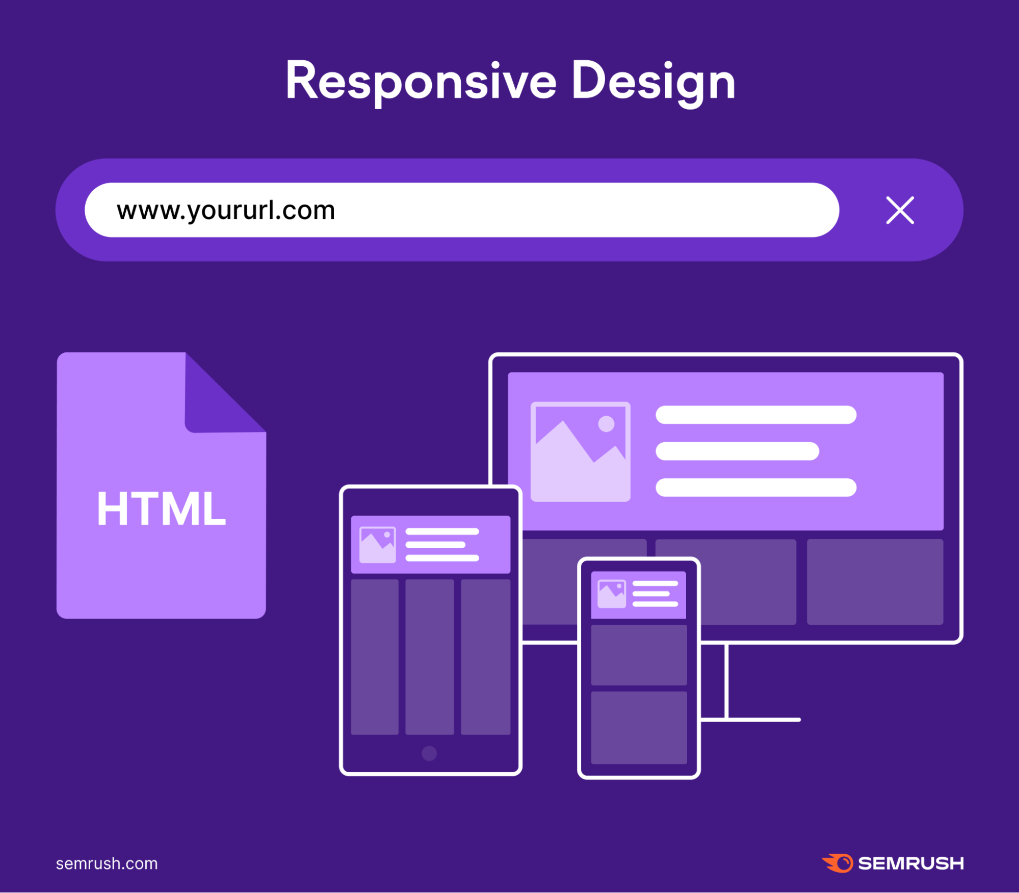
It’s very critical that Google can clearly understand your website’s mobile setup and which of these three configurations you’re using. When you use responsive web design, your mobile site will have the same HTML code and content for the same URL regardless of the user’s chosen device. Use the meta name=”viewport” tag within your website’s source course.
More so to help the browser identify how to adjust the content. Then, the display settings will change to fit each visitor’s screen size. Over 60% of organic search visits now come from mobile devices. As mobile searches are on the rise, desktop searches continue to decrease. And according to Google, 56% of in-store shoppers used their phones to research products.
The Best Mobile SEO Practices For Website App Indexing And Ranking
Think there’s no connection between your mobile app and search engine optimization? Think again because Google is changing that! Now is the time to take mobile app SEO seriously and ensure that your apps and content rank as highly on search engines as they can. Google decided in 2019 that the mobile-first index would be enabled by default for all new websites.
With most web traffic now coming from mobile devices, Google will first direct searches to mobile-friendly websites and, importantly, offer suggestions matching mobile apps with related search terms. Responsive web design is very popular among SEO experts everywhere, and Google itself even recommends it.
You should consider responsive design because:
- It’s easy to share content from a single URL.
- Google can easily index your single URL for higher search engine rankings.
- You’ll find it convenient to maintain multiple pages for the same content.
- This design avoids common SEO and formatting mistakes.
- There won’t be much additional setup time.
- Googlebot will use fewer resources and make crawling more efficient.
- Users won’t have to deal with redirects offering shorter page download times.
Whenever it comes to mobile optimization, technical SEO services are at the core of it. Google uses mobile-first indexing. That means it “predominantly uses the mobile version of the content for indexing and ranking.” This became the default in 2019.
So any time Google indexes and ranks your content, it prioritizes the mobile version of your website. Note that there aren’t separate indexes for desktop and mobile. There’s just one. And it prioritizes mobile. But Google will continue showing users the most appropriate website in search results — whether desktop or mobile.
Your best course of action is to cover your bases and optimize your site for mobile users if you haven’t already. The following is a list of optimization methods that can be used to make your site mobile-friendly.
1. Speed up your website
To get ready for the mobile-first ranking, several things must work on. Regarding sales and the general user experience (UX), we suggest starting with the speed of your website, especially on mobile. There are a few things to help make your mobile website run faster:
AMP
The Accelerated Mobile Pages (AMP) project is open-source to improve the mobile environment. Because it uses a stripped-down version of HTML, it can load web pages much faster than normal HTML. Google also stores your material in its cache to increase load times. This makes the experience much faster and smoother, making it easier to appear in the search results.
People have discussed problems with the show URL (when people load an AMP page, they see a stored Google URL), but the traffic still goes to your website. Since then, Google has changed so that people who share the URL will share the publisher’s link instead of the cached Google URL.
Pro Tip: If you run a WordPress Website, you can use a pretty cool tool to turn your pages into AMP and Instant Articles for Facebook.
PWAs
PWA Progressive Web Apps (PWAs) is an option to switch to AMP. The important things that sell them are:
- Dependable—it loads right away
- Fast—it reacts quickly to what users do.
- Engaging—it feels like a normal game on a device and has an engaging user experience (UX).
Overall, the layout will always adjust to different computing devices accordingly. It’s a win-win for mobile SEO!
PWAMP
Google’s Gary Illyes first used “PWAMP” at SMX Seattle. It means a PWA built on AMP HTML, JS, and CSS. Even though PWAMP websites may not be confirmed as AMP pages, they load very quickly and offer all of the benefits of a PWA. They might be the way of the future, so keep an eye on them. You should ignore it.
If your present mobile-friendly, responsive website works well, gives a great user experience, and loads quickly, you may not gain much by switching to AMP or any other choice. Before choosing a new road, we suggest you fully audit your mobile website version.
2. Create an optimized landing page for your mobile app
Responsive design allows you to serve the same page to both mobile and desktop users. The server sends the same HTML code every time. CSS changes how the page renders based on the device. Like this:
Responsive design is best for SEO because of the following:
- Allows users to share pages and link to your content with a single URL (rather than a separate “mobile” URL)
- Reduces the chance of common mistakes that affect mobile sites
- It is less time-consuming to maintain than other methods
- It doesn’t require redirection for users to have a device-optimized view (which can reduce load time)
- Saves resources when Google crawls your site — Googlebot will only crawl the page once instead of multiple times
Google recommends using responsive design for your website. You won’t need to deal with duplicate content issues or redirects that can slow down your site when using responsive design. Instead, you can create one responsive page for each piece of content. This will save you a ton of time. Plus, you won’t have to worry about the design of responsive pages.
3. Manage your content for mobile devices
It’s important to emphasize the quality of your in-app content first and foremost. Google launched app indexing back then, and it essentially allows mobile apps to appear in Google searches, taking users directly to the app in their respective app stores.
Suppose you are currently using a separate subdomain to handle your mobile experience; you are probably offering different content on desktop and mobile (otherwise, you could have just gone responsive in the first place). If that’s the case, the change to the mobile-first ranking will affect you the most. Your results right now are based on your desktop information.
If some of that is missing on mobile, you might not rank as well in the future. Even if you have a flexible mobile site, you may want to change how it looks to improve sales from mobile. There are some “must-dos” for handling your information on mobile devices. For example, you should use collapsible menus and drop-down options correctly.
Google has already said that sites won’t be penalized for “hiding” information behind an accordion or drop-down bar. They know there is only so much space on a mobile device, so it makes sense not to show people everything simultaneously. They have also said they will crawl all the material in drop-down menus, so be smart about how you use them in your mobile design.
4. Consider the mobile checkout procedure
Google says that 85% of customers start buying something on one device and finish it on another (or in a store). How can we get past that and improve the process of checking out on a mobile device? Streamlining your checkout process is a great way to speed it up and make it easier for people to buy from you, especially on mobile devices. Also, quicken the process!
This may seem clear, but the changes to page speed suggested above can make a huge difference in how many people buy or convert. Less information is needed at checkout. Your marketing team may want to get as much basic information as possible, but do you need to know when a customer was born? What about those three phone numbers (home, cell, work, etc.)?
Make your checkout form as simple as possible, which will also help speed up the process by observing a few basic elements.
Consider the following:
- Make it easy to get around: This goes back to what we said about word size, tap targets, and space up top. To make the checkout process as easy as possible, think about what people will click on and what they will need to read. Make sure this works well, and those sales will go up.
- Avoid pop-ups: You are almost done making a deal. Do you need to show a pop-up to the customer at this point? Most likely not. If it looks like they will leave their cart, you might want to think about a pop-up that will get them to the end of the queue. Otherwise, keep the checkout clear and simple.
In addition, your target users should also be able to save information for the next time. People switch between devices, so letting them save their baskets for later (without signing up) is a great way to get them to check out their baskets. Of course, treats are another way to do this, but telling the customer that their basket will be ready later is a good way to woo them back.
5. Do not disable CSS, JavaScript, or images
When mobile design first emerged, blocking resources like CSS, JavaScript, and pictures was helpful. Some of these features could cause the page to load slowly or not look right, so hiding them from GoogleBot on mobile was better. Today, though, things are different. Smartphones are often more powerful than the computers that people have at home.
They can handle anything we throw at them because they have faster computers, more memory, and more space. These things can also be taken care of by Google’s smartphone GoogleBot. So make sure you show them everything if they can handle it. Google will be able to put your content in the right category and rank it. Make sure there’s nothing you’re trying to hide.
The dynamic serving method shows different HTML based on the user’s device. But the URL doesn’t change. Essentially, the content lives on the same URL. But the server provides different codes to each device. Here’s an example:

But Google prefers responsive design over dynamic serving. Here’s why: Dynamic serving sites can show users the wrong page version. So servers can accidentally show a desktop version to someone using a smartphone, which can be frustrating and create a bad user experience. Read Google’s guide to dynamic serving to know why they recommend RWD instead.
6. You have to think mobile-first before you can act mobile
To optimize for the mobile-first index, businesses must start thinking about design, development, and user experience (UX) from a mobile-first perspective and worry about PCs later. If companies don’t change their thinking, they will continue to plan and build for desktop and then think about how that works on mobile. It’s also good to work on separate URLs.
This lets you set up separate URLs for your desktop and mobile websites. So you’ll have a URL for the desktop version of your site and another URL for the mobile version. The desktop URL looks like your typical URL: https://www.yoursite.com/. While the mobile version usually replaces part of the URL with an “m” or the word “mobile”: https://m.yoursite.com/ Like so:
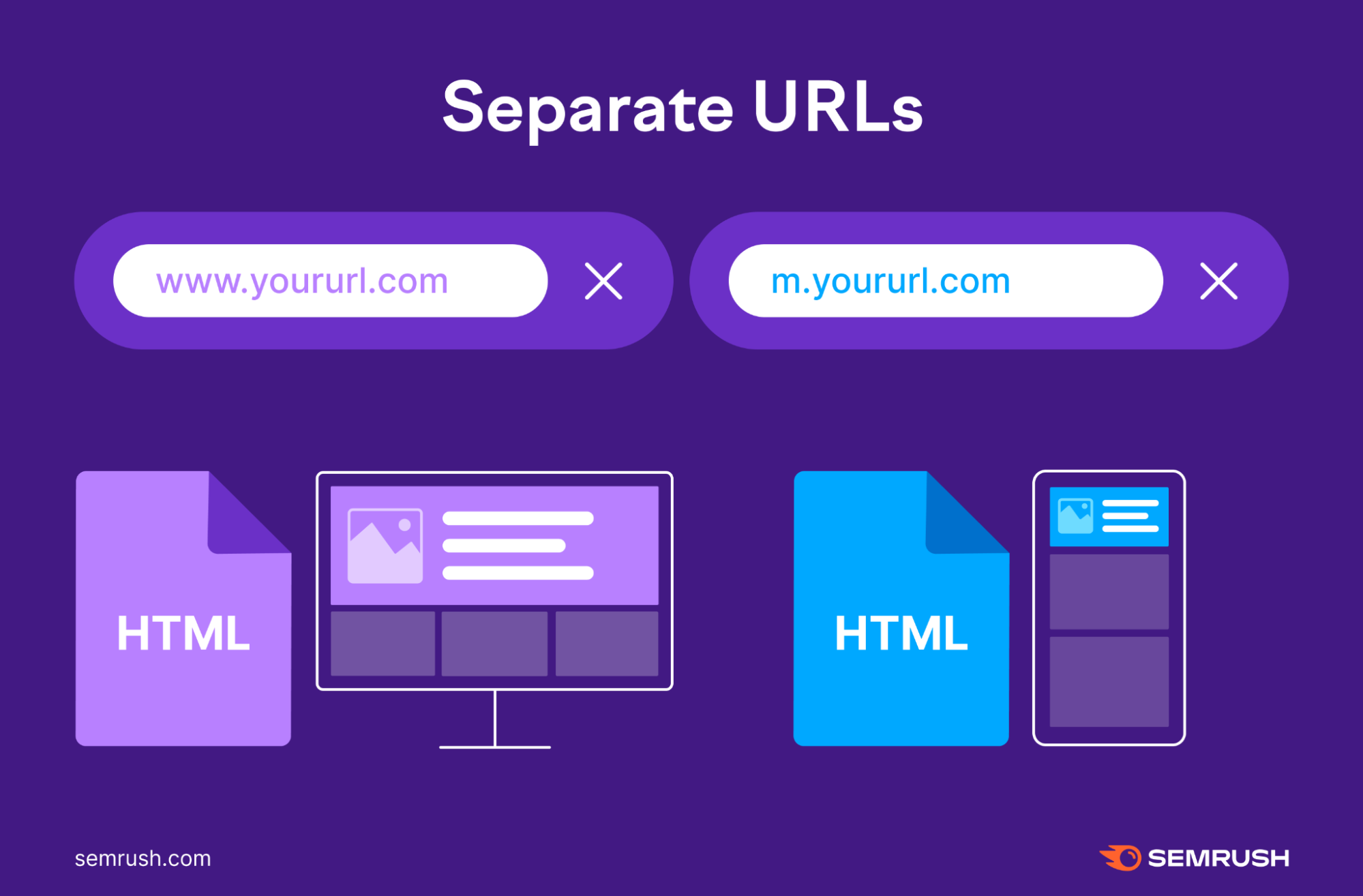
Google strongly recommends avoiding this tactic. When someone visits your website, the server will determine what device the visitor uses and direct them to your mobile or desktop website version. The issue with this solution is that it can take a lot of effort to manage. Each page has two versions; rel=”canonical” tags or rel=”alternate” tags to their HTML codes.
This lets Google know which is the primary version of each page.
- On mobile pages: Set a rel=”canonical” tag pointing to the desktop version
- On desktop pages: Set a rel=”alternate” tag pointing to the mobile version
If you don’t properly set these tags, Google may register desktop and mobile pages as duplicate content, confusing Google when ranking the correct page. You can read more about the process in Google’s guide to separate URLs to gather more.
In short, you should set up the separate URLs properly. Otherwise, you could spend a lot of time fixing Technical SEO issues you can avoid in the first place. And your Google rankings could suffer.
7. Optimize the title and description of your website and app storefront
Optimizing your app title and description can boost your mobile application ranking and make you stand out. This ensures you can get key information into your app title and description, often the only thing users will read before deciding whether to download an app. This is a chance for your app to take a position previously given to a website.
Being an indexed app may be the only way to rank at the top in mobile Google searches. Keywords like ‘games’ and ‘editor’ are common triggers for app packs and carousels. Still, Google is also prominently surfacing apps for queries that seem to be associated with utilities or verbs. Mobile app store search rankings are based on a combination of various features.
Such as combining App Store Optimizations (ASO) and traditional SEO. That’s why coupled with titles, descriptions, and device and platform keywords, these practices all count. Additionally, dynamic success metrics impact the ranking of your mobile app. The best way to judge your success is to track multiple metrics.
Consider the following:
- Number and quality of ratings, average rating score, and content and sentiment analysis of reviews
- Number and frequency of app downloads
- Engagement and retention
- Internal links in the app store
- Freshness
For iOS, the primary public metrics are ratings and reviews. However, app performance can be inferred using the app store’s ranking charts and search results, which can be leveraged as proxies of these performance metrics. Increasing your app’s average rating number, rating volume, and application-based downloads will influence search ranking.
In Conclusion;
Our lives are mobile, and to get a good Search Engine Results Page (SERP) ranking, it pays to be mobile-friendly. As we all carry out more and more work using our smartphones, enterprise apps will become the norm for businesses with staff on the go. Your app’s content must be optimized and high quality to ensure you rank highly on search engines.
Simply making a website that works on all devices is not enough. It is best practice, but just because a website is adaptable doesn’t mean it is optimized for mobile. Start right now. Leave the PC behind when you think about your next development or design change. Instead, talk about how it will work on a mobile device. Drive organizational change to accept the AMP stage.
This is a mobile-first world we are all rushing into. Of course, you won’t be able to do it easily, but it will be worth your time. Google Mobile First Index is an effective way to make your website more visible. It can help bring in more visitors, improve SEO results, and make browsing easier for mobile users. You should consult an SEO agency to get the most out of SEO.
Especially to ensure your website is properly set up for mobile-first indexing. Use their services to take your website to the next level for better results! Google can search deep within your mobile apps to find and take the user to specific pieces of content. Moreover, the importance of app indexing has only increased, with more users than ever using search to find new info.